- hello@daggloballtd.com
- No. 3 Ebong Close Wealth avenue, Palmsbay estate Abijo G.R.A. Lekki Epe exrpress way, Lagos State, Nigeria
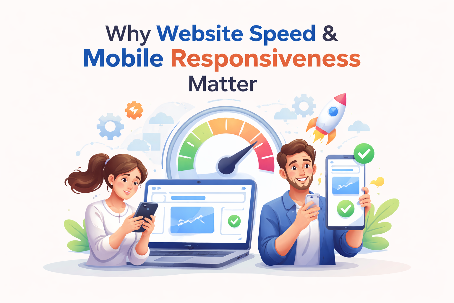
Slow Website? Here’s How Speed & Mobile Responsiveness Are Costing You Customers
24
Mar
Picture this.
Someone hears about your business. Maybe a friend mentioned it. Maybe they saw your post. They click your link with curiosity… and then they wait.
One second.
Two seconds.
Three seconds.
And just like that they’re gone.
Not because your product wasn’t good.
Not because your offer wasn’t compelling.
But because your website didn’t arrive fast enough to greet them.
That’s the silent truth of today’s digital world: speed and responsiveness aren’t technical luxuries—they are your first impression, your handshake, your welcome smile.
What Is Website Speed (And Why It Feels Like Trust)?
Website speed is simply how fast your pages load and become usable. But to your visitor, it feels like something deeper.
It feels like:
-
Reliability
-
Professionalism
-
Effort
Behind the scenes, performance is measured using metrics like:
-
Load time
-
Interactivity
-
Visual stability
Tools like Google PageSpeed Insights and GTmetrix help you understand how your site performs in real life.
But here’s the truth: your visitors don’t care about the metrics—they care about the feeling.
If your site is slow, it feels like something is wrong… even if they can’t explain why.
What Is Mobile Responsiveness (And Why It Feels Like Comfort)?
Mobile responsiveness means your website adapts beautifully to any screen whether it’s a phone, tablet, or desktop.
Think of it like this:
A responsive website is like a well-designed room that rearranges itself depending on who walks in.
-
On mobile → clean, easy, thumb-friendly
-
On desktop → spacious, structured, detailed
If users have to zoom, scroll sideways, or struggle to click buttons, they don’t stay. Not because they’re impatient—but because your site didn’t fit into their world.
Why Website Speed Matters More Than You Think
1. Speed Shapes First Impressions Instantly
Before anyone reads your headline, your website has already spoken.
A fast site says:
"We value your time."
A slow site says:
"You can wait."
And people rarely do.
2. Slow Websites Quietly Increase Bounce Rates
When pages lag, users leave without exploring.
You don’t just lose traffic you lose opportunity.
Every second of delay creates friction. And friction kills curiosity.
3. Speed Directly Impacts Conversions
Whether it’s:
-
Buying a product
-
Filling a form
-
Booking a service
Speed influences decisions.
A faster website doesn’t just feel better it performs better.
4. Search Engines Care About Speed Too
Search engines like Google prioritize fast, user-friendly websites.
That means:
-
Faster sites rank higher
-
Higher rankings bring more traffic
-
More traffic creates more growth
Speed isn’t just technical it’s strategic.
Why Mobile Responsiveness Is No Longer Optional
1. Most People Visit Your Site on Their Phones
Your audience isn’t sitting at a desk anymore.
They’re:
-
On the move
-
On their couch
-
In between moments
If your website isn’t mobile-friendly, you’re turning away the majority of your visitors without even realizing it.
2. Mobile-First Indexing Is the Standard
Google now evaluates your website based on its mobile version first.
If your mobile experience is weak, your rankings suffer—no matter how good your desktop version looks.
3. User Experience Builds Trust
A smooth mobile experience feels effortless:
-
Text is readable
-
Buttons are easy to tap
-
Navigation is intuitive
And when something feels easy, people stay longer and trust more.
Where Speed and Responsiveness Meet
Here’s where things get powerful.
Mobile users often have:
-
Slower internet connections
-
Smaller screens
-
Less patience for delays
So if your website is:
-
Heavy
-
Unoptimized
-
Not responsive
…it performs worst exactly where it matters most.
But when your site is both fast and responsive, something magical happens:
It feels natural.
It feels easy.
It feels right.
Common Mistakes That Are Quietly Slowing You Down
Many websites struggle not because of big problems, but small overlooked ones:
-
Oversized images that take too long to load
-
Too many plugins or scripts running at once
-
Poor hosting services
-
No caching strategy
-
Ignoring mobile optimization
These issues stack up and slowly push users away.
How to Improve Website Speed (Without Overcomplicating It)
You don’t need to rebuild everything. Small changes can create powerful results:
-
Compress and optimize images (use modern formats like WebP)
-
Enable browser caching
-
Minify CSS, JavaScript, and HTML
-
Choose reliable, fast hosting
-
Use lazy loading for images and videos
Think of it as removing weight from your website so it can move freely.
How to Make Your Website Truly Mobile-Friendly
Design for real people, not just screens:
-
Use flexible layouts (responsive design frameworks)
-
Keep font sizes readable without zooming
-
Make buttons easy to tap (thumb-friendly spacing)
-
Test your site on different devices
-
Avoid intrusive pop-ups on mobile
A good mobile experience doesn’t just look better it feels better to use.
A Simple Transformation Story
Imagine two identical businesses.
Business A:
-
Slow loading
-
Hard to use on mobile
-
Visitors leave quickly
Business B:
-
Fast, smooth, responsive
-
Easy to navigate anywhere
-
Visitors stay, explore, and convert
The difference isn’t luck.
It’s experience.
And experience is what people remember.
The Future Belongs to Fast, Flexible Websites
As technology evolves:
-
Users expect instant results
-
Mobile usage keeps growing
-
Attention spans keep shrinking
Soon, “good enough” won’t be enough.
The websites that win will be the ones that feel effortless almost invisible because everything just works.
Conclusion: Your Website Is Either Opening Doors or Closing Them
Every visitor who lands on your site is a moment of possibility.
Speed determines whether they stay.
Responsiveness determines whether they feel comfortable.
Together, they decide whether that moment becomes:
-
A conversation
-
A connection
-
A conversion
Or just another missed opportunity.
FAQs
1. What is a good website load time?
A good load time is under 3 seconds. Ideally, your site should feel almost instant to users.
2. Does website speed really affect SEO rankings?
Yes, it does. Search engines like Google consider speed a key ranking factor because it directly impacts user experience.
3. How can I test my website speed?
You can use tools like Google PageSpeed Insights or GTmetrix to analyze your website performance and get improvement suggestions.
4. What does mobile responsiveness mean in simple terms?
It means your website automatically adjusts to look and work perfectly on any screen—especially smartphones.
5. Why is my website slow on mobile but fast on desktop?
Mobile devices often have slower internet and less processing power. If your site isn’t optimized, it will struggle more on mobile.
6. Can I improve my website speed without redesigning it?
Yes. Optimizations like image compression, caching, and script cleanup can significantly improve speed without a full redesign.
7. Is mobile responsiveness important for small businesses?
Absolutely. In many cases, small businesses get most of their traffic from mobile users. A poor mobile experience can cost you real customers.
A Final Insight to Elevate Your Brand
Don’t just think of your website as a platform.
Think of it as a living experience.
Every second it loads…
Every tap it responds to…
Every scroll it guides…
It’s telling a story about your brand.
Make sure it’s a story that feels fast, effortless, and unforgettable.